How to use Flexible Layout for SharePoint Page Design
Flexible Layouts in SharePoint offer a new way to create dynamic and adaptable web pages, providing users with more creative freedom and the ability to design engaging and unique experiences.
This article will cover:
Standard vs Flexible Layouts (aka: what is a SharePoint Flexible Layout?)
Benefits
Considerations - Mobile View
Best Practices
Flexible Layout Design Sample
Standard vs Flexible Layout
SharePoint previously had a certain number of standard gridded layout available for pages: one column, two columns, tree columns, one-third left/right, vertical, and full-width section. All of these options adhere to rigid column structures, where users can only position and resize web-parts in a limited number of ways.
While SharePoint’s standard layout options are great to quickly and efficiently create scalable designs, they can limit design freedom and creativity. This leads to fewer options to create truly engaging and unique experiences for users.
The Flexible Layout section, on the other hand, is a more recent option that offers increased flexibility allowing users to create dynamic and adaptable web pages in SharePoint.
Benefits
The first and the most obvious benefit of Flexible Layouts is… you guessed it, the flexibility with design options. Web parts can be moved, resized, overlapped, and grouped within a two-dimensional grid, allowing for more creative and customized layouts.
As can be seen in the image below, the grid and alignment guides are still there but they are less strict, meaning that web-parts can be resized and moved around freely as long as they fall on the greyed out squared grid.

Grid alignment in Flexible Layouts allows for images to be resized and moved around freely.
However, if trying to resize an image that falls in-between grayed out grid lines, it is going to automatically snap to the closest greyed out grid. See the image below for an example.

Images will automatically align with nearest grid lines.
Some web-parts, such as People and Quick Links, have 4 pre-defined size options. These sizes correlate directly to sizes of the web-parts in the non-flexible layouts. The resize hints will show up on the screen to guide you and the web-part will automatically snap to the nearest available size.

Web-parts such as People and Quick Links have four pre-defined sizes.
Some other web-parts are only restricted in heights – having flexible width scalability, for example Editorial Part, Banner, Calendar, Link etc.
Those limitations allow your designs to be consistent and visually appealing even without deep knowledge of layout rules and graphic design.
When using the Flexible Layout you can stagger web-parts on top of each other – you can also control the arrangement and group the web-parts. One of these options is very helpful with making designs accessible for mobile, another one breaks the mobile view – but more about that later.

Users can control arrangement and group the web-parts.
The properties pane for the section can be accessed by clicking on the section and navigating to the settings icon, has not changed majorly for the Flexible Layout. The option of choosing between different column layouts has been removed since it’s not relevant to flexible Layout, and the option to choose how to Reorder on mobile has been added.
The default selection is “Top to bottom” (as seen in the image below), however, there is also a “Left to right" option for design. The ‘best choice’ is solely going to be based on the type of page you’re making and trying out and previewing both of those is important.

Top to bottom OR Left to right options for Mobile reorder.
The web-parts unfortunately cannot be added to the Flexible Section directly, you’d have to drag them from one of the Column Layouts to the Flexible one directly, duplicate an existing part, or select it from the Toolbox on the right side of the screen.
Besides Grouping the items, you can also CTRL Select multiple items to move them along the page together.
Considerations
The standard layout options were optimized for the mobile experience as well as the computer browser. With the new flexible sections, you'll want to take into consideration how the arrangement and stacking of web parts affects the display on a mobile device.
The Flexible Layout is straightforward and opens so many doors to beautiful designs and creativity but also reminds us to keep an eye out for accessibility.
Staggered parts, overlaying images and text will be displayed one by one on mobile. That doesn’t mean by not overlaying you aren’t using the full potential of the Flexible Layout, but more so just being careful about decorative elements as they will be displayed differently.
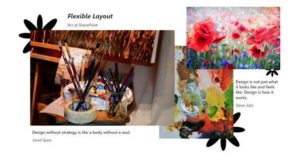
In the picture below, only necessary items were used without any of them being decorative. All the images used are somehow relevant to the quotes, the point being made, or to the information this page holds.

Images can be staggered in Flexible Layout, however, as can be seen when viewed on desktop.
When viewing this page in the mobile view, it will be displayed relatively accurate to the design (the top to bottom reorder option is used here, but again, do what’s best for your design as each one is unique).
Design from Flexible Layout as seen via mobile view.
As seen in the image above, they are not overlaying anymore and the order is not as precise as we want it to be, but here are some tips on how to fix this.
Best Practices for Flexible Layout
Grouping the elements together might be a good idea. First in this article’s sample, the first 2 text boxes will be made into 1, removing unnecessary web-parts and following one of the main design rules is keeping it simple (KIS). The spacing of the text will also be adjusted to mirror the web design.
The display order can be changed by grouping parts together (parts in red are grouped) and changing the reorder property from Left to Right.


The mobile version already shows notable improvement without any modifications to the web design.
Let’s see what would happen if some decorative imagery is added, keeping everything else unchanged.
Shapes (flowers) added to design with Flexible Layout, as seen in desktop view.


In mobile view (as seen in the image above), the decorative flowers added are now showing up at the bottom of the page and have 0 informational value to them, which could be very distracting if more content was added to the page.
The rendering of arranged(staggered) parts is very different on mobile. Depending on the design, it would make sense to either remove them, or repurpose them for your mobile view. Repurposing is meant to create a different purpose for them than just being a nice design touch.
For example, they could serve as “dividers” between the images. This can be achieved with what’s mentioned above: changing the reorder property, or grouping (this is where it saves us!!), or removing them (KIS).
Some good questions to ask yourself:
Does this decorative part help navigate through the content? Or is it distracting viewers?
Does it bring any value to the viewer?
Would my design have the same feel to it if I remove the decorative part?
Does this part make sense? Is it connected to the point I’m making?
Those questions are less of the “Yes/No” kind and more like “Not yet, but I could try to make it”.
In this example, the flowers would make sense to keep if users could keep control over the displayed size. Unfortunately, SharePoint doesn’t currently allow users to control sizes of images for mobile view without customizations, so in this sample, the decision was made to remove them.
Another unfortunate detail about this layout that affects mobile view is that spacers do not seem to work. Which is logical: since it’s not a rigid column structure then why would users need a spacer if they can place the web-part anywhere on the page?
Even though it’s not useful for the web view, it would be wonderful to have in mobile view, since the way it’s displayed is in one column the flexible layout web-parts end up being squished together with almost no padding.
That doesn’t necessarily mean that there shouldn’t be any decorative parts in your designs, it just means you should be very strategic about them or use flexible layouts along with standard column layouts.
Design Example
Here is an example design that looks both great on web and mobile.
Even though multiple web-parts were overlapped, all of them make sense on their own as well. And since items on mobile view have only one width option – the editorial web-part will not have any unnecessary space displayed.
The background space image that’s being cut off by the white rectangle is actually just a simple background image edited to fit the sample organization’s needs. This reduces the number of decorative parts and ensures that the background is read the same across devices.
Users can control the order of web-parts by either changing the “Reorder on mobile” property or grouping items that they want to be displayed together.

A visual design created with Flexible Layout in SharePoint that is optimized for both desktop and mobile view.
Summary
While flexible web parts are amazing and can lead to some truly spectacular design options in out of the box SharePoint pages, they should be used when appropriate. Standard column layouts still serve a purpose and will scale and display on mobile without the need for additional effort. A great mix of both types is what's going to make your page pot and stand-out and also be functional across multiple devices.
If you have any questions or need additional SharePoint support, be sure to reach out to our team! Also browse the Gravity Union Blog for more valuable guides to design in SharePoint.